New Tool for Data Visualization/Dimension reduction
Wei-Ying Wang and Stuart Geman, 2017
We developed a very simple yet effective algorithm, called PSA, the Prediction-Shift algorithm. The algorithm combines ideas of mean-shift and PCA. In particular, we can adjust a parameter to achieve either data visualization or dimension reduction.
Data Visaulization with PSA
In the left is the original points, and in the right is the result of PSA after 6 iterations. It captures the “spiral” shape of the data.
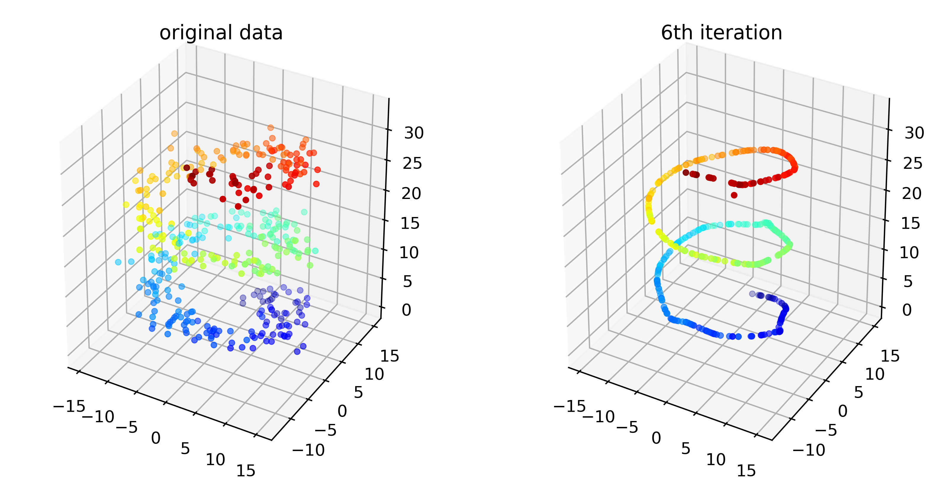
The operation took less than 1 second in my python script for 400 3D data points.
Dimension Reduction with PSA:
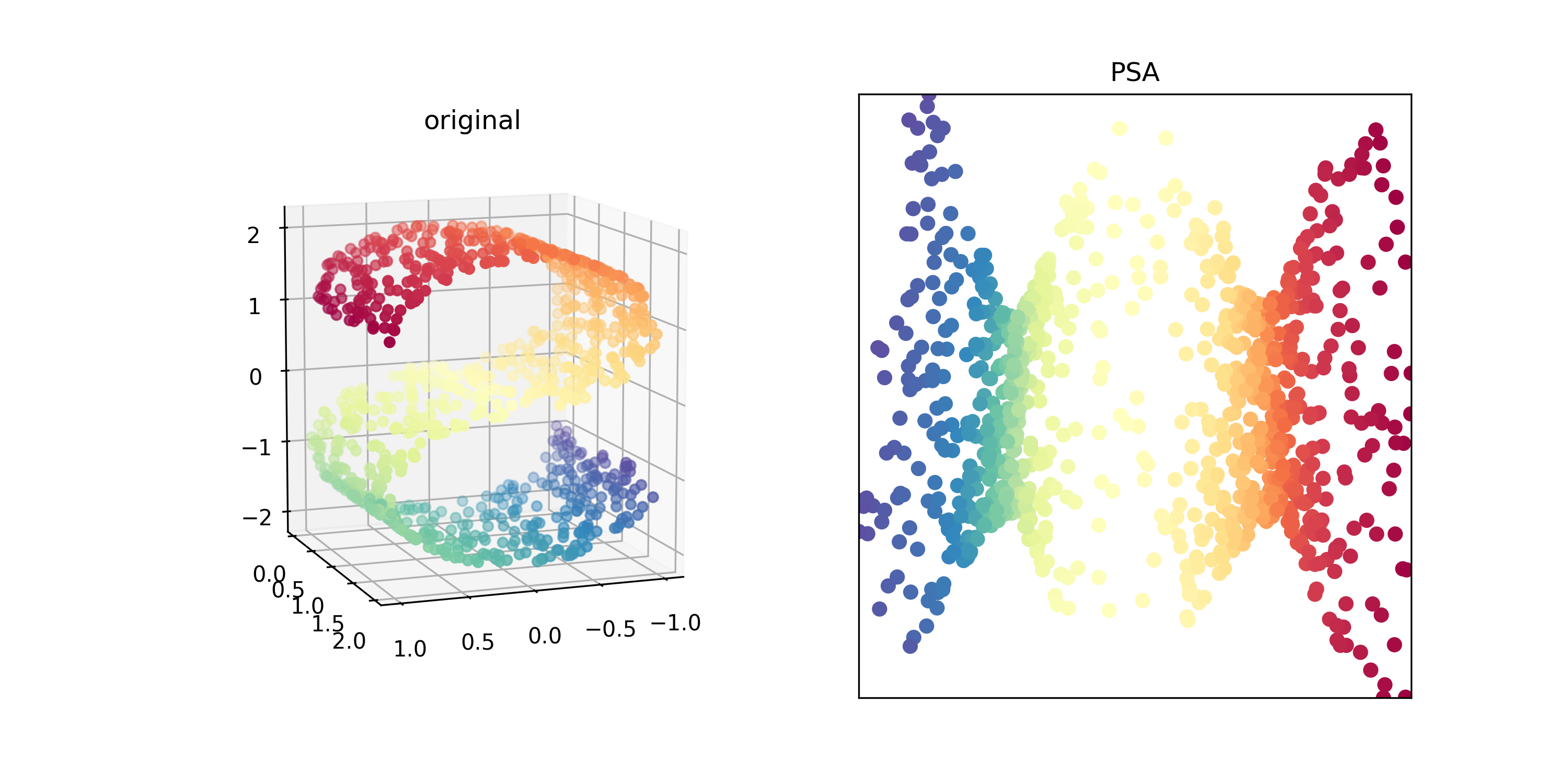
Let’s test our reduction algorithm with the famous S-shped data used in LLE (Local Linear Embedding, see here.) In the next plots, the left plot shows the original data, and the right one is the result of PSA after 100 iteration. Note that the color of each points are corresponding to each other. This took about 5 second for this 1000 data.
Perhaps the best way to understand how it work is through the video. In the following video, we can see how it “unfolds” the complicated structure of data.
One can reduce data to any lower dimension. Let’s reduce our first example to one dimension.
Appendix
PCA is probably the oldest tool to achieve dimension reduction. If you run PCA on data (or say, do spectrum decomposition on the empirical covariance matrix), the direction of the largest eigenvector (which corresponds to the largest eigenvalue) will be the vector that achieves the widest spread of the data. That is, if you project your data to the vector, the reduced data will have the largest variance among the projections from any other vectors of the same dimension.